Monday, July 9, 2012

Assignment 6

                   Charles Burchfield
Wallpaper design. The qualities in this design are how you can feel the cold winter day, wet and sluggish. The trees are dead and the street is flooded with melting snow. Charles Burchfield based his work off of life experiences and what he was surrounded by. He also loved viewing nature. Charles grew up in Ohio and he first wanted to be a nature writer but then transferred to the visual aspect.


           Rembrandt Harmenszoon van Rijn
The Three Crosses is an etch that was done by the dutch artist Rembrandt. the qualities in this etch is how complex it is, the shadows and light are so unique. You can see the emotions in the people crying, sad and shocked. What Rembrandt did was express feeling and emotion especially trying to relate it in spiritual ways. He lived in the 1600's when religion was a very important aspect of its time the church had a lot of power. So him being surrounded by religion he wanted to express what visual he had on the spiritual life or the past stories.


                            Jasper Johns
Three Flags. This interested me because how the flags have the old tradition stars of only 48 on them. Also it is unique because of how vivid the colors are. Jasper has had many works of art that are very patriotic like Three Flags, Flag and Map, they all represent America. Jasper lived during the Korean War which may be his influence to these pieces. 
                              Jackson Pollock
The qualities I see in Jackson's paintings are how the first layer is dark so the top layer when using different/ brighter colors it really shows the complexion. Jackson did experiments with liquid paint he discovered and called one technique as the "drip" technique. His work is described as "action painting". A major influence in Jackson's life was his wife, he dealt with alcoholism which led to his death in a car accident. Jackson liked to be different and get involved in his work in a different way then most artists, he wanted it to be different and special.


                             Emil Nolde
The qualities I see in Emil's watercolor paintings are how greatly detailed they are. Having to work with watercolors in the past I know personally it is not an easy task but Emil makes his artwork look wonderful without any flaws. Emil was very interested in flowers and many of his works are focused on flowers like this one here. He was very interested in Vincent Van Gogh's work as he was his inspiration. Emil lived during a dark time when WWII was occurring Hitler rejected his work in museums. Emil therefore loved using colors he once mentioned the colors make him happy inside and express many good feelings.
                 
                                        Robert Rauschenberg
Robert makes his artwork unique by he makes his work "combined". He wanted the space between life and artwork to be defined and exposed. His concepts were consisted of combining the times and places into one, to show the importance of what he was trying to get across to the viewer.


Monday, July 2, 2012

Blog 5

                   
                             Balance
                                                                          -->
Asymmetrical balance can be seen in Childe Hassams "Rainy Day, Columbus Avenue, Boston" by the woman and daughter to the left are closer to us as well as the horses and buggy on the left side of the painting make the left look "heavier and darker" but it is balanced on the right side by having bigger buildings and more people walking through the streets.                                                                                                                ^


                         Emphasis
Emphasis is where a artist makes the viewer focus on the focal point. When Anna Vallayer-Coster painted "Still life with Musical Instruments" what she did was make the viewer draw their attention to the violin. This attention is drawn there because of the object is in the middle, shaped differently and brighter. the second would be the book located to the left of the violin because of the bright white and how large the object is compared to the rest. The third object that would I focused on was the horn as I made my way from right to left that is the next interesting thing that my eyes see the old gold circular shape. 


                        Repetition
Repetition is when something is repeated over and over again, artists can show this by showing the same shapes, colors or regular patterns. Jacob Lawrence does this in "Story Painter" by having the women stand in the same pose with their arms held in the air with an object in their hands.


                     Contrast
Contrast and variety could be seen as opposite characteristics. In Frank Gehry's "Dancing Building" we can look at the building oddly shaped on the left as smooth from the glass, dark because we see dark features inside, again oddly shaped. The building to the right of it is painting fairly bright, but we know it is rough like cement and has a fairly normal build to it as much like any other buildings.

                          Visual Movement
In Raphael's "Raffaello Sanzio" this painting makes us have visual movement by having all the bodies focused in a pyramid like shape, for instance how their arms focus on one point then ones gaze makes us look at where they are looking .We see every person in the image looking at each other which eventually leads us in a movement that ends at the first person we looked at.
                         Scale
An artist may use at times scale or proportion to manipulate the size of an actual object. In this case Claes Oldenburg used "Saw". This saw is usually about an grown mans arm length but this one as seen is buildings high, pretending to saw through the earth. We would call this an "large-size" saw, obviously not real and for artistic purposes only.


Monday, June 25, 2012

                                         Hatching
Hatching is done by artist by creating parallel lines, the closer the spacing of the lines the darker the area is. Hatching creates good images of shadows from another object. In this example Looking into a hand-mirror II Mary Cassatt displays a example of hatching. Mary's work with hatching in this imagine is used very well with the woman and child's hair as well as how detailed the shadowing is behind the child's back.


                             Atmospheric Perspective  
Atmospheric perspective is when objects such as mountains change their appearance, objects further away from us appear less distinct, often bluer in color and the contrast between light and dark is reduced. Madonna with the Yarnwinder by Leonardo da Vinci displays this perspective by the mountains in the background do not seem to be that far away which we know they truly are. The mountains also seem to have a blue tint to them.


                  Arbitrary Color  
Arbitrary color is when artist use colors that are not "true colors". In this painting Pierre Bonnard shows arbitrary color because trees are not blue, in this particular painting the tree on the left  is. Also in this painting the woman standing next to the tree has a completion of her whole body blending in.  


 Analogous color
Analogous color is when a piece of art makes you feel a certain way. If a person see's a blue they think cold or the range from yellow to orange and red people think warm. In this piece Odysseus by Romare Bearden I think of death with the area covered in red as well as the skull being presented in the picture.   Texture 
Texture is how something is composed of, it could be rough on the skin or smooth or sharp. Texture can be many things. Feeling things is human nature but when it comes to pieces of art somethings are not meant to be touched. Michelangelo's Tomb of Lorenzo has a smooth like texture just looking at it but still as humans we would want to touch such a statue which we cannot or the pieces of work would be ruined.

 Frottage
Frottage is kind of a visual effect on a person. When we look at this Terre Ecossaise by Max Ernst we think that when we touch it, it would be wavy and smooth, but actually it would be flat and smooth. What frottage does is give us this visual effect because of how Max Ernst would place a piece of paper over a non flat surface and rub a pencil over it to gain these effects. 
  

Monday, June 18, 2012

Chapter 4 & 5

                            Contour Line
"Sketch of a Bison" by Henri Gaudier-Brzeska demonstrates the term Contour Line by in this sketch he indicates the edge of a three dimensional form. The contour lines around the bison show how his horns and legs come out further in different areas. Henri has multiple sketches that show great examples of contour lines including the example in the book of the Female Nude Back View pg 57.


                              Implied Line
Implied line is a function of line of sight, a direction in where figures given a composition are looking. Alberto Giacometti's Trois hommes qui marchent I is an example of implied line because how the two outside individuals are facing towards the person in the center. How the outside individuals have a slight lean at the waist and their heads are facing the center like they are looking at the middle person, as well as their legs are arched and in front of one another as if they are walking towards the middle individual. 


          Expressive Line
Expressive line is defined as A kind of line that seems to spring directly from the artist's emotions or feelings loose, gestural, and energetic. Vincent Van Gogh's Straw Hat is a great example of expressive line because you can see how all the tiny lines in the work, all pieced together to make a man wearing a straw hat. 


                           One Point Linear Perspective


In a One point linear perspective lines are drawn on the picture plane in such a way as to represent parallel lines receding to a single point. In Duccio's Maesta you can see the perspective being focused on the virgin Mary and baby Jesus, How you can tell this perspective is by looking at all the lines focusing on the center for example the groves on the pillars and the second floor railing focusing right on Virgin Mary's head.


                    Axonometric Projection


Axonometric projection is a type of parallel projection used to create a pictorial drawing of an object, where the object is rotated along one or more of its axes relative to the plane of projection. Theo van Doesburg creates this in De Stijl by making the drawing at an almost 45 degree angle looking down at the object and having the lines run at a parallel projection. 


            Foreshortening


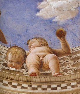
Foreshortening is when a artist makes the dimensions of the closer extremities adjusted in order to make up for the distortion created by the point of view. In Andrea Mantegna's Ceiling Oculus she makes the babies feet actually smaller than they should be so his feet do not look over sized or bigger like a comic book which is not like how a picture in real life would make the babies feet look. Foreshortening is done so we can see the whole picture than one big object to focus on such as feet for example. 


Monday, June 11, 2012

                         Form Vs Content
When this image is first viewed it is viewed as a black box, but after reading more about Kasimir Malevich and the "Black Square" I discovered that there is a lot of context and meaning behind the square. Despite the form of just a black square on a white canvas Malevich's intentions were to change the way of art which he had called a form of supremacist. In this particular piece the square is viewed as a timeless wonder.


                         Representational
Albert Bierstadt painting "Niagara" is a great form of representational of how Niagara Falls looks and how it may of looked before man started construction of skyscrapers and so on. This image is a form of realism because anyone can notice the waterfall, trees, rocks and etc, these are common things in everyday lives that the human eye is accustomed to.


                           Abstract Art
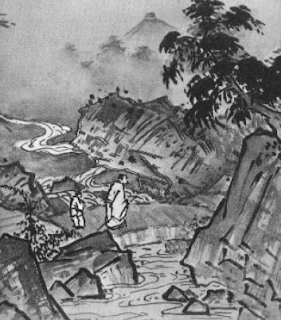
In Sesshu Toyo's paintings there are slight abstractions. How sharply the edges of rocks are darkened, how the river has some straight lines in it to represent water. To the human eye you can tell what everything is but you have to really look in detail to piece everything together, for example I did not notice that the river started at the bottom of the page until I saw the lines that represented the flowing of water.


               Non-Objective Art
Beatriz Milhazes in Mulatinho is a form of non-objective art because there is not one specific piece in her paintings that she is focusing on. There are many objects but just in different sizes,shapes and locations. All these different "objects" are not natural in any way.


Icon-Marilyn Monroe became an American Icon for many reasons, either it is the reason she came to fame so quickly or that she spoke what was on her mind what she did was change the way women were seen. Marilyn revolutionized how woman dressed and acted allowing woman more freedom.

Iconoclasm-16th century during the Reformation. Relief statues in St Stevenskerk in Nijmegen, the Netherlands, were attacked and defaced in the Beeldenstorm.This is an example of iconoclasm because how the religous sculptures were destroyed for a change.

Monday, June 4, 2012

The Roles Of Artist

Christo and Jeanne-Claude helped viewers see the world in new and innovated ways by making spectacular works like this. This art work is not hung on walls of a museum it is brought into large work areas like these trees seen here. Other works involved mountains, islands and buildings too. These works of art take items in our everyday world and transform them differently to see these land forms in new and inovated ways.


David Jon Kassan creates brilliant works of realistic art. His drawings look almost like photographs but they are not. He captures visual records of many people (which is main focus). His portraits are life size as well. David is a great example of how he does not look at things differently but captures it to record it in his work.  

 Pablo Picasso puts so much meaning into his work by making his pieces so complex and interesting. A person may have to stare at his pieces for along time to try to figure out what he is trying to say. This makes his concept of changing objects or women in this case into pleasurable, but also imbuing them with meaning. This piece for example, what I see is a woman looking into a mirror and seeing the ugly bad side of herself rather than what everyone else sees.
Jan Van Eyck painted naturalistic paintings, mostly portraits and religious subjects. He also made use of disguised religious symbols. His most significant piece is the altar piece at the cathedral at Ghent. Where this Adam and Eve painting is in part of.
An example of Kitsch are these earring's inspired by Andy Warhol's paintings. These are a form of very odd earring's that are not normally seen by people to be worn. These earring's made me laugh a little when I first saw them because of how unique and eccentric they are.
Vincent Van Gogh's paintings are very aesthetic. This is because you have to view all the colors and boldness. You have to search the surrounding areas of the environment and it makes a person think about every detail to try to piece it together. His work stirs up an sensation of interest and many questions.